Color psychology
February 21, 2019
Color psychology
Colors can have a ton of different meanings. The psychology behind color is complex, but to keep it short, colors have certain emotions and ideas attached to them.
Red: Red stands for excitement, passion and anger. It’s a great choice if your brand is loud, youthful and wants to stand out.
Orange: Orange is much less used than red but it’s just as energetic. This is a vibrant, invigorating and playful color.
Yellow: If you want to look accessible and friendly, yellow is the right choice. It gives off a cheerful, affordable and youthful energy.
Green: Green is extremely versatile and can work for any brand really. It’s especially perfect for anyone who wants to establish a connection to nature.
Blue: Blue is a very classic and common choice. It is calming and cool and symbolizes trustworthiness and maturity.
Purple: Purple can be your ticket to looking luxurious. Depending on the shade, purple can be mysterious, eclectic or feminine.
Pink: If you’re going for girly, nothing works better than pink. But that’s not all! With shades like pastel rose, millennial pink or neon magenta, pink can give your logo a grown up and cool, but still youthful and feminine look.
Brown: Brown may sound like a strange color choice at first, but it works perfectly for rugged and masculine vintage logos. It can give your brand a handmade, unique and aged look.
Black: If you are looking for a sleek, modern and luxurious look, black will be a great choice. A minimalist black and white logo is the way to go if you want to keep it simple.
White: You want your logo to look clean, modern and minimalistic? Use lots of white in your logo. As a neutral color it works in combination with all other colors, but adds a clean, youthful and economical touch.
Gray: Gray is the ultimate color if you want to achieve a mature, classic and serious look. Darker shades look more mysterious, while lighter shades are more accessible.
Combining colors
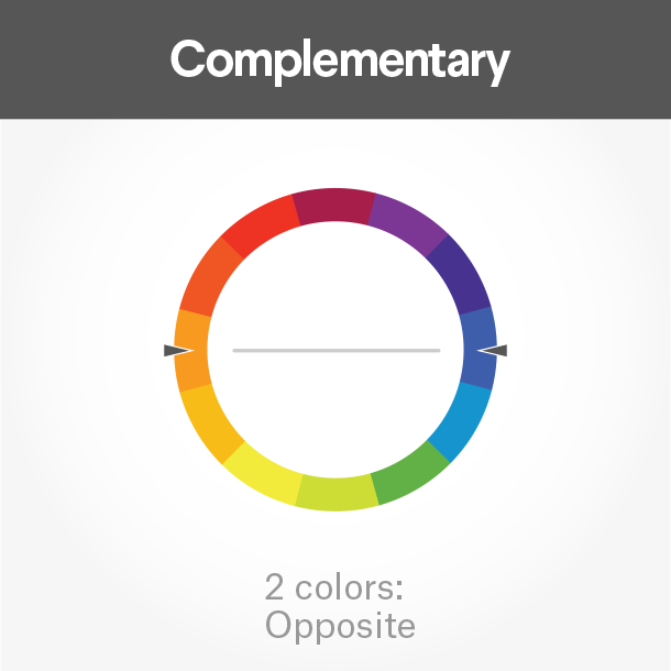
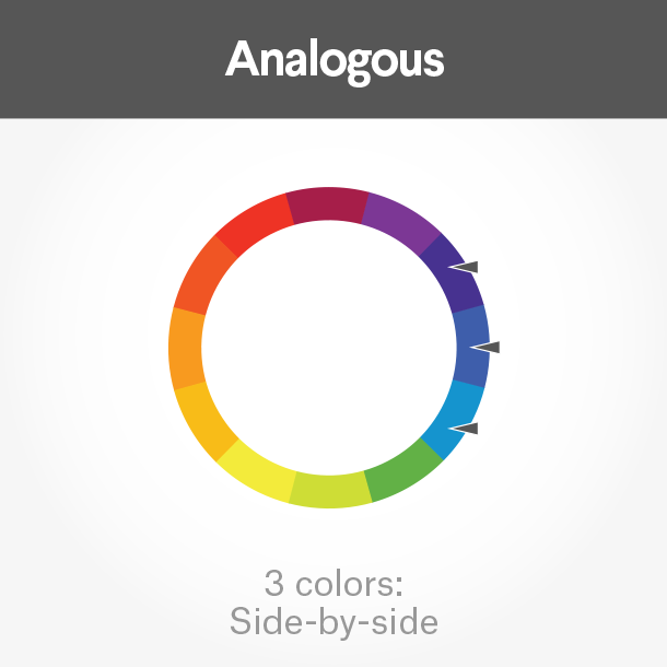
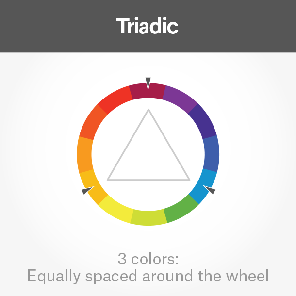
Of course you don’t need to stick with a monochrome logo using just one color, but you can combine several logos colors to tell a complete brand color story. To choose colors that work well together, take a look at the color wheel.
Complementary colors lie directly across from each other on the color wheel. They bring out the best in both colors and create a very dynamic look.
Analogous colors fall close to each other on the wheel. If you want your logo colors to be harmonious, these will work well together.
Triadic colors draw from three equal sections on the color wheel. Pick these for a stimulating and bold effect.
